BRINGING TO LIFE THE TRUE MEANING OF MODERN HERITAGE
PROJECT SCOPE
Since 1757, Cinzano has brought its flavor and accessible personality to the world, so that everyone can appreciate the authenticity of everyday life.
Everything we need to embrace this new era is already in the brand’s DNA. After more than two centuries of history and countless moments experienced at the center of the spirit of our time, Cinzano has developed a strong and distinctive visual imprint that contains all the elements that inspired RBA Design in the development of the restyling of the Vermouth and Sparkling Wines category, as well as the Mother Brand.
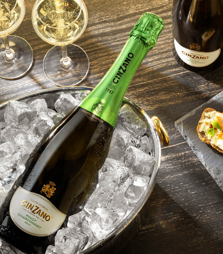
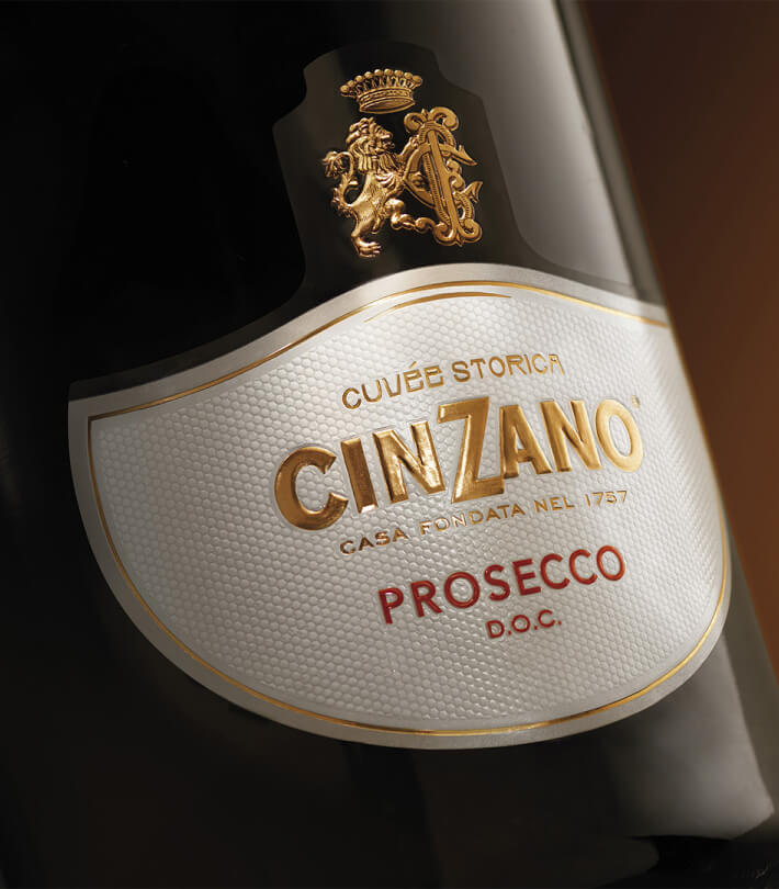
SPARKLING WINES
The new identity is based on Cinzano’s great Italian history, bringing to light its origins and recovering the shapes of the labels, the signs, and the texts that came from the first sparkling wines dating back to the mid-nineteenth century.
All these elements, reinterpreted with a contemporary touch, present a unique and authentic differentiating style. The brand has evolved and strengthened thanks to the introduction of the original Cinzano family crest, represented by the lion, and the writing “CASA FONDATA NEL 1757”, an element of storytelling and heritage.
The labels recall the authentic shape of old sparkling wines and are made on white paper with a pearl effect and with different finishes that give greater prestige and quality to the products. Finally, the capsules are characterized by sophisticated and bright colors which help to distinguish the products of the entire range as well as add a strong visual personality.
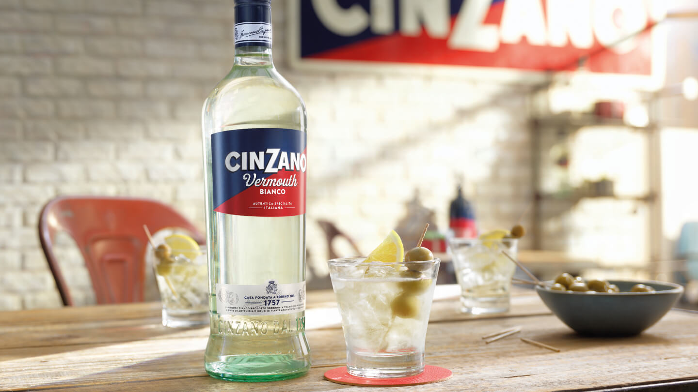
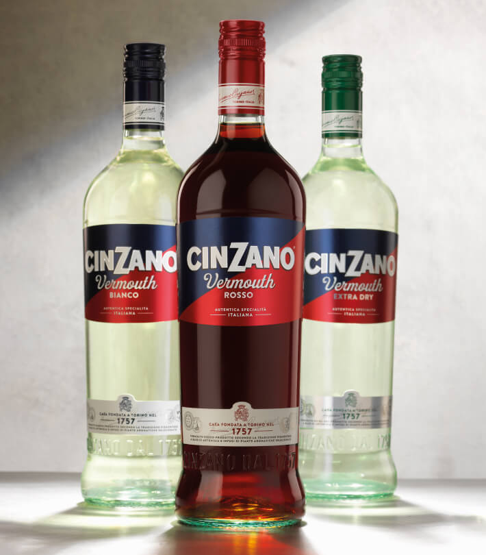
CLASSIC VERMOUTH
Classic vermouth is the undisputed protagonist of Cinzano’s packaging redesign. It is a celebration of the golden times of this brand and for this reason, the most distinctive asset has been brought back to the forefront: the diagonal line.
Red and blue date back to the very beginnings of the Cinzano family: in fact, the original family heraldry included two stars (representing the founding brothers) which dominated a blue and red coat of arms.
Since 1952, these colors have marked the packaging of Cinzano Vermouth and its visual identity in general. This is the starting point from which RBA Design began the development of the restyling of the Vermouth Cinzano line.
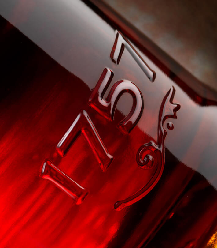
The red and blue diagonal lines characterize all three Vermouth products and take on a central role in the new bottle, which transmits all the heritage of the brand through the secondary label at the bottom (awards and signature of the Cinzano brothers) and through “1757” embossed on the glass of the bottle, designed and created from scratch for this new packaging identity.
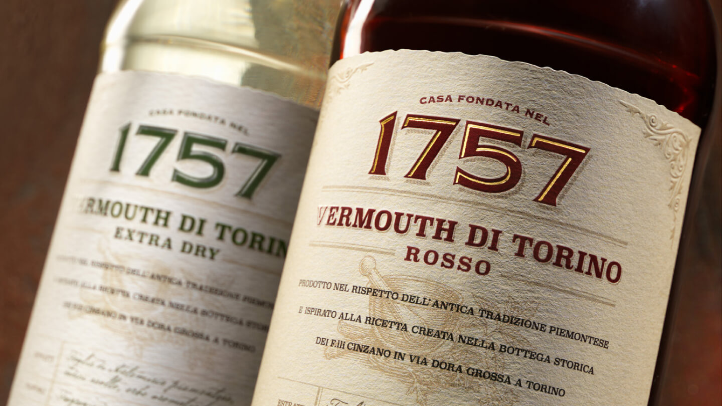
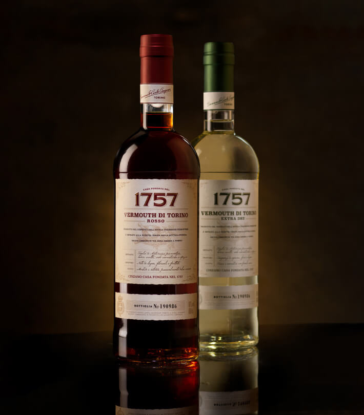
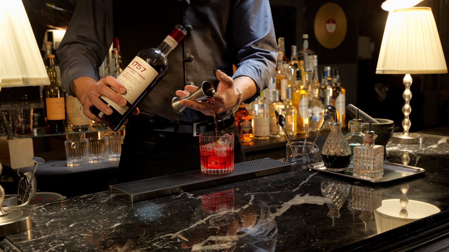
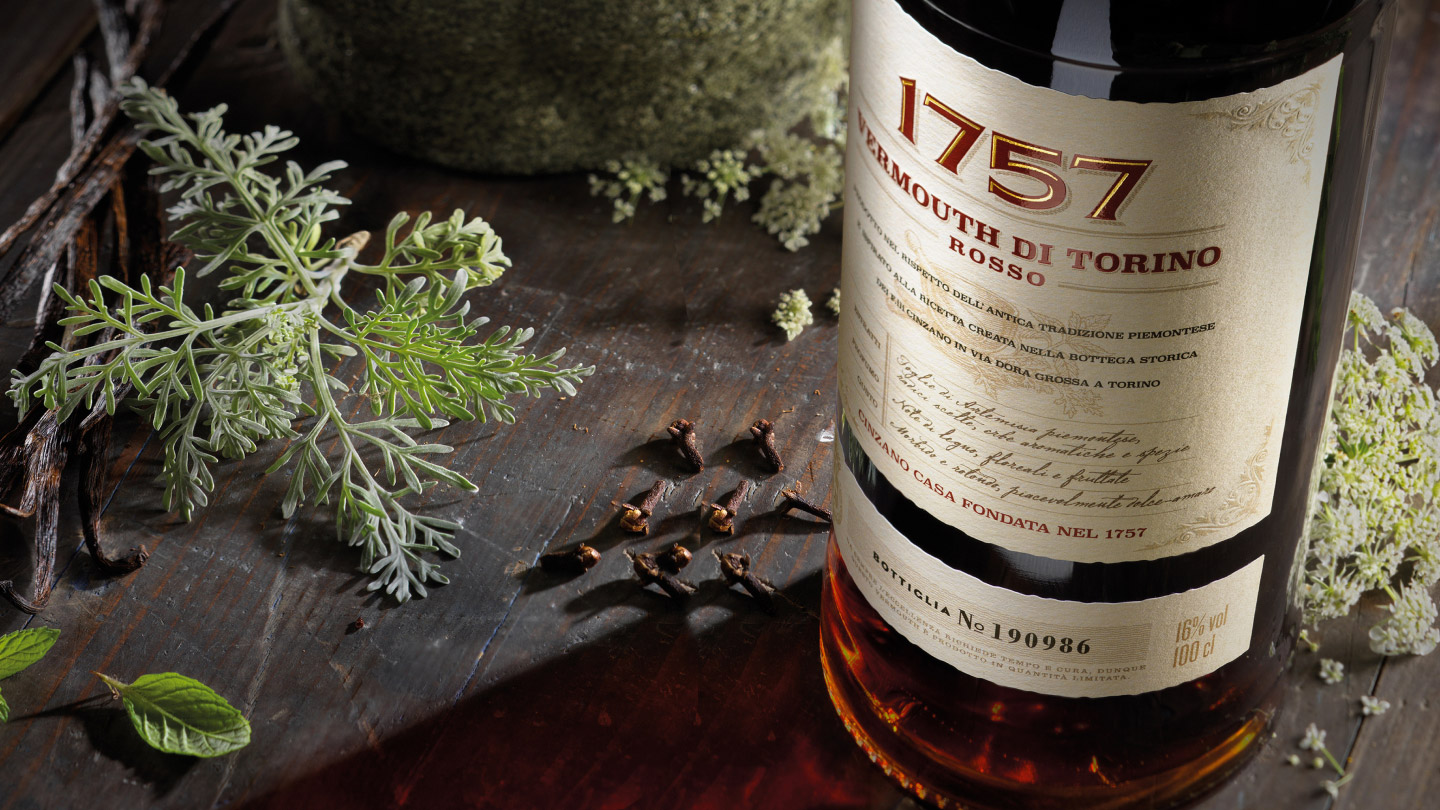
1757
In 1757, Turin was full of new and exciting drinking trends. One of these was a fine wine infused with herbs: its origins were ancient, but the enthusiasm was brand new.
In the end, it was called vermouth, but even before that everyone – including royalty – knew where to find it: the Cinzano brothers.
Centuries later, its charm remains intact and you can enjoy the same experience with a glass of 1757 Vermouth di Torino.
The number is a tribute to the year Cinzano was founded, but above all, it brings vermouth back to where it belongs: on the shelves of the best bars, in the glasses of the finest cocktails, and on the palates of the most demanding customers.
The new bottle, designed by RBA Design, is defined by its extraordinary simplicity, with a balanced and decisive shape. The label is the representation of a recipe book printed on physical paper, dedicated to the ingredients, flavor notes, and tradition. The graphic language is elegant and sober, and conveys the high and premium quality of the product.