SWEET EXCELLENCE
Since 1946, Bindi has been committed to creating excellence in a world of sweetness.
The history of the largest pastry shop in Italy began seventy years ago in Via Larga in Milan, and stretches to the present day with the birth of FDA Group. Over the years, a great expansion has seen the brand take center stage both in Italy and abroad (Germany, France, the United States, the Middle East, and the East) thanks to the passion of a cohesive team of experts with shared ambitions.
What drives the brand is the continuous search for quality and excellence, core elements both in the preparation of desserts, of which they are specialists, and in the efficiency of a service that responds to the desires of consumers.
The Maestri del Dessert thus amaze with shapes and colors, creating goodness that becomes a pleasure for the eyes and the palate. The brand offers products with a refined taste that combines an all-Italian sweetness and a modern character, to which RBA Design has given a new and elegant look.
THE NEW DESIGN: A SYMPHONY OF TASTE
Quality and excellence are at the center of Bindi’s world, and this is why it was important to create a project that was perfectly in line with the attention to detail that distinguishes the brand.
The revamping work of the brand identity started from the restyling of the logo and the creation of a new visual identity, and involved both offline and online activities, for a coordinated image which was then transferred to all the materials and communication tools useful to convey the brand’s storytelling.
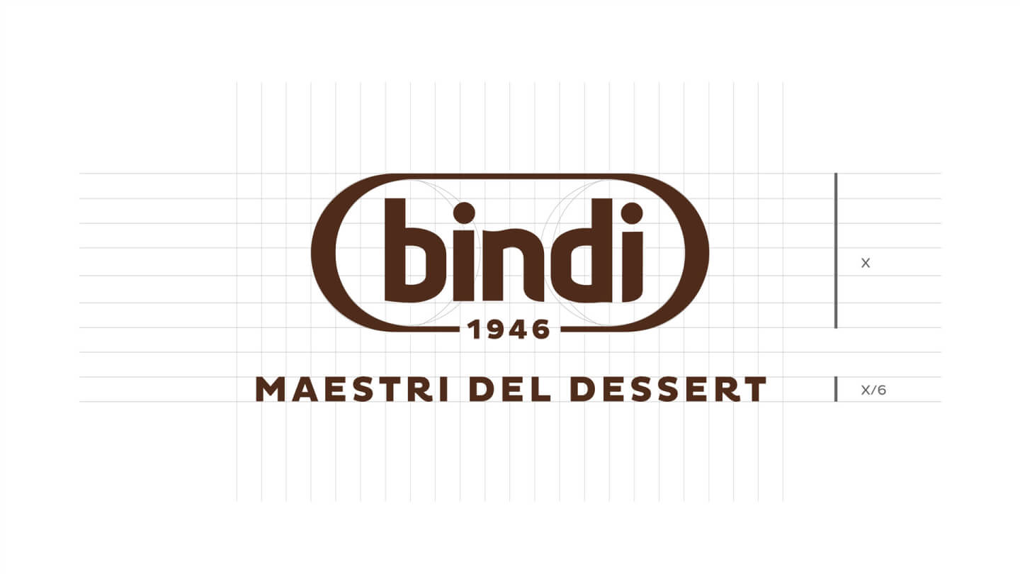
Then, a logo was designed with the aim of consolidating the brand and transmitting values such as Italianness and artisanal knowledge. The chosen imagery immediately brings us back to the world of sweets. Composed of simple and sinuous lines, the new logo features the company’s foundation year and then presents the brand payoff “Maestri del Dessert” with an equally linear but memorable font, designed by the agency to highlight the professionalism of Bindi’s pastry chefs and their artisanal touch.
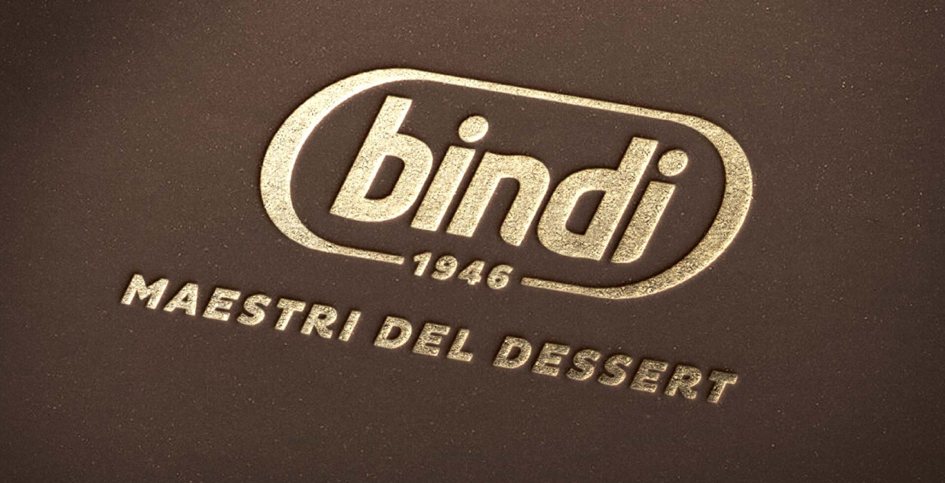
A true synergy of sweetness and savoir-faire, the packaging combines the classicism of chocolate brown hues with that of gold, in the design elements that can be viewed inside the Accademia del Dessert as well as in all the catalogs dedicated to the company’s delicious products. This was a wide-ranging project, which included additional work on stationery and bags, as well as the customization of means of transport, boxes, and products, and the creation of stands for trade fairs.
Even browsing the website, again developed by the agency, becomes a journey into taste and quality, with a narrative that ranges from Bindi’s sweet news to the growth of the brand around the world.
The latter completes all the communication on the excellent goodness that RBA Design has created for the brand, with the aim of underlining the craftsmanship and Italian nature of this historic name.
A new design for a new concept of dessert, capable of best combining tradition and innovation, with a warm tone of voice close to consumers but that always conveys the professionalism of the Maestri del Dessert.