A SYMBOL OF LIGHTNESS
ITALIAN AUTHENTICITY IN THE USA
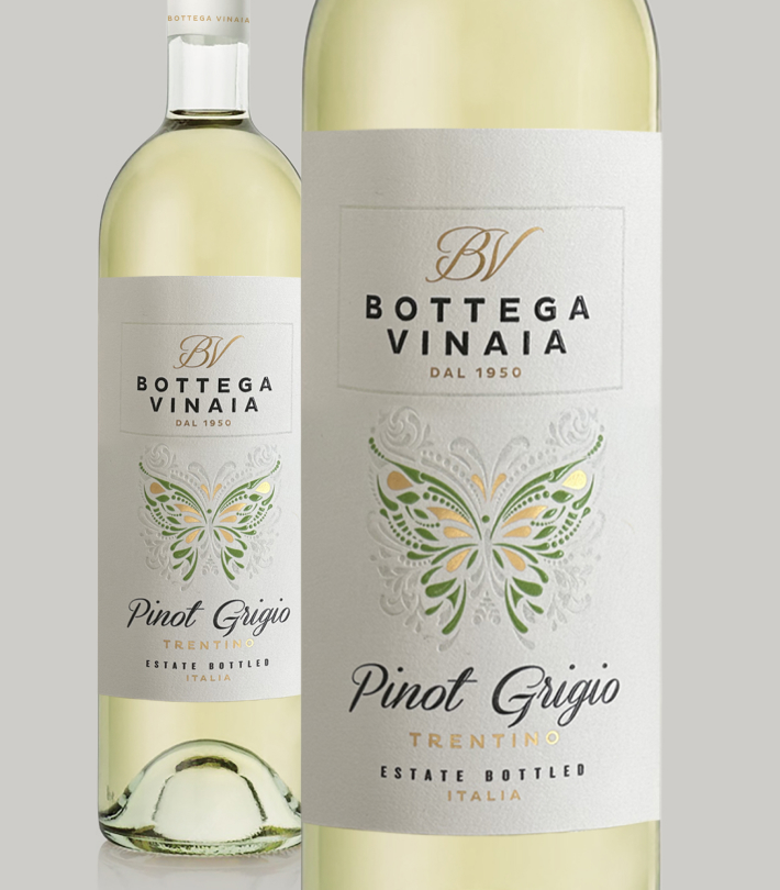
A brand born in the Cavit house, Bottega Vinaia differentiates itself from its competitors thanks to its distinct personality and its connection with the Italian territory, particularly the region of Trentino.
With a medium-high positioning and communication aimed at a female target, it is intended exclusively for the American market. The brand has quickly joined the ranks of Italian premium wine producers, thanks to the constant commitment and unflinching passion of the company’s growers and oenologists.
Through imagery that is visually linked to the world of fashion, Bottega Vinaia focuses on authenticity, terroir, and Italian winemaking tradition.
It does so by offering two great products, which become the protagonists of the brand story: Pinot Grigio, an elegant wine with a floral aroma, and Pinot Noir, fruity, fresh, and structured.
The former pairs beautifully with seafood dishes and is the right choice for aperitifs, while the latter goes perfectly with meats and grilled dishes.
A FEMALE WINE
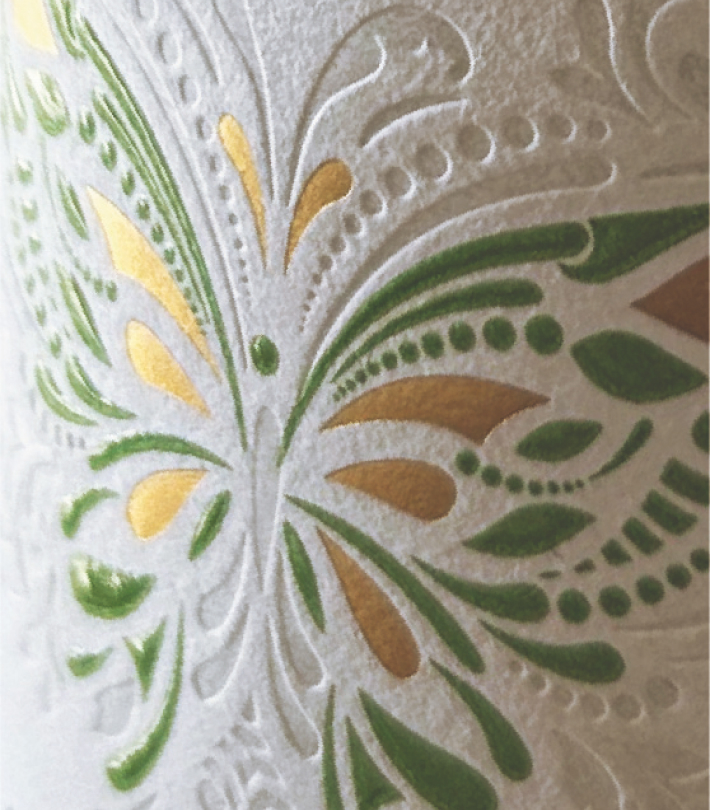
RBA Design’s expertise in wine design and label design brought the agency to select a specific symbol for Bottega Vinaia: the butterfly.
The inspiration comes directly from the shape of the Trentino area, a place rich in natural beauty, and is combined with a spirit of elegance, transformation, and lightness – intrinsic characteristics of this fresh and easy-to-drink wine.
A market survey highlighted that this was the ideal wine for female consumers, a target that would tend to desire a product with similar characteristics.
This is why we worked to create an equally fresh and delicate brand positioning, with creative research based on harmonious but at the same time high-impact symbols.
By entering the Bottega Vinaia website, we are invited to stand out with character, thus conquering our space in the world. The Italian spirit, naturally, appears in the whole corporate storytelling approach.
The graphics, created by the agency, are particularly elegant and reflect the feminine essence of the brand. In the color palette, the predominant colors are gold, burgundy, green, and grey. While the logo hints at the fashion universe, the labels feature a graceful calligraphic font that almost seems to associate the brand’s name with the image of the butterfly, in a rich and detailed design frame.
The new brand identity, and consequently its positioning, is therefore closely linked to the place of origin of the wine, taking on an equally natural and characteristic appearance. By doing so, both the founding values of Bottega Vinaia and the authentic spirit of the brand are communicated in an impactful way.