Password Heritage, or history, experience, legacy. Expressing the value accumulated over time helps in conquering markets around the world. To do it well, however, you need culture, respect and competence.
2021 ended with two important certificates of esteem for our country. We are referring to the recent article published in The Economist and the intervention of the President of the European Commission, Ursula von del Leyen, during her speech at the Catholic University of Milan. . A hymn to the work done by Mario Draghi but also to our way of being, to the Italian spirit, to the reputation of a country which already during the summer had shown, thanks to the successes of the Italian athletes, the desire and ability to fight and be reborn investing in traditions to create new paths.
It is therefore a positive moment for our reputation abroad and we must take advantage of it; in all fields, at all levels.
We thus offer you our point of view on how to communicate Italian origin through the brand and packaging design, starting by examining some very successful cases in the food market: products that have gained the trust and memory of foreign consumers, as well as a premium placement on shelves worldwide. We do it with three brands that are in the history of our country, examining a client of RBA Design, Cinzano, and two projects by others, emblematic and in everyone’s memory, San Pellegrino and Mutti. Has packaging design contributed to the success of these products? Can we identify a style, common to these brands, capable of expressing their origin?
La nuova bottiglia Cinzano 1757The new Cinzano 1757 bottle
It is a story that begins in 1757, in Turin, in a shop in Contrada Dora Grossa (today the central Via Garibaldi), where the Master Acquavitai Carlo Stefano and Giovanni Giacomo Cinzano prepared and offered to the Piedmontese aristocracy those delicious flavored and liqueurs which would then become, a few years later, the “Vermouth of Turin”. An authentically Italian story, characterized by the close relationship between family and business, by the indissoluble bond with the territory, but with the desire to be international and pioneering.
A positioning that inspired our design work, which took shape thanks to this precious story: In the Cinzano archive we found all the material we needed to face “the next 260 years”. “. Because it is a great responsibility, handling a heritage of almost three centuries: respect is needed to preserve its charm and value; and courage is needed to restore in the present that adventurous, enterprising and slightly bold spirit that animated “Francesco Cinzano and Company”, founded in 1868.
The new bottle, Cinzano 1757, a packaging that effectively expresses the essence of the brand.
S.Pellegrino, icon of waters
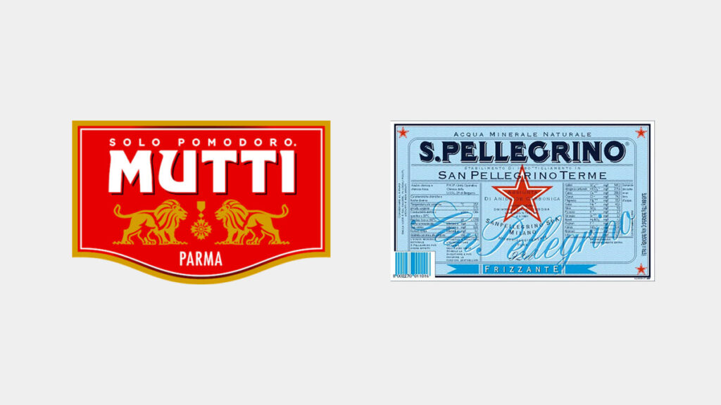
It is a very successful water, present in many of the best restaurants around the world. The water, whose fame is also documented by Leonardo Da Vinci, flows from the San Pellegrino springs of the same name, the natural spas that became an exclusive destination for the European bourgeoisie during the Belle Epoque period. S.Pellegrino water, right from its label, transmits the heritage of Italian prestige, suggested by the red star – which represents the ancient symbol that between the nineteenth and twentieth centuries marked quality products intended for export – and the white and blue filigree, a tribute to the Art Nouveau style. . The bottle is the classic green Vichy, which once represented the standard for all mineral waters; subsequently everyone adopted proprietary bottles except S.Pellegrino, which remained unchanged and immutable in the “old” green Vichy, today a true icon.
Mutti, the sauce of the two lions
If we move to the United States, one of the most iconic brands of thriving Italian antiquity is Mutti: they were the first to make tomato paste and in the 1970s they exported tomato pulp in cans, conquering the American market. The statues of the two lions placed on either side of the name are there to claim its Italian origins: imposing monuments, living antiquity that expresses history and knowledge. The logo made the brand recognizable from the beginning, allowing even the illiterate to recognize “the sauce of the two lions”.
What can we learn from these successful examples? What do these brands have in common?
They all communicate what the Anglo-Saxons call Heritage which in our language means heritage, inheritance. Often archaic images are used (although almost always revisited in a modern way) which show visual elements that belong to past eras: monumental columns, gold medals (won at the various universal exhibitions for the quality of the products), lion heads, etc. dating back to past eras, which evoke ancient traditions and craftsmanship. But why are these icons successful? Because they are the images that live in the heads of foreigners when they think of Italy. Magnificent squares, monuments, ancient architectural works, Renaissance paintings, Roman remains, columns, medieval villages, and so on. Their main imaginary of our country is this; they don’t just buy a product but an experience, they identify with our lifestyle, in the beauty of our places, in the warmth of the sun, in the empathy of the inhabitants, in our social relationships.