A world of bread and ideas
Morato, with its “50 years of bread and ideas,” is now one of the most important and appreciated players in the world of bread derivatives.
Since 1970 it has been proposing a new concept of bread: practical, tasty, and innovative in its format. All this while remaining familiar and close to its consumers. Just like its products, which range from soft breads and piadinas to delicious breadsticks and crispbreads.
With the help of the various acquisitions the brand has made over time, Morato is now a benchmark in the industry, not only in Italy, but also abroad, guaranteeing products for all tastes and with consistent quality. In addition, the brand’s commitment is also dedicated to nature, territory, and people. This is thanks to a precise organizational model, a code of ethics that reflects Morato’s values, and a certified quality system.
The request from the brand was to enhance its image even more, making its brand identity more contemporary and personal, creating a very recognizable and distinctive graphic system, but at the same time not overly homologating products and lines with a strong personality.
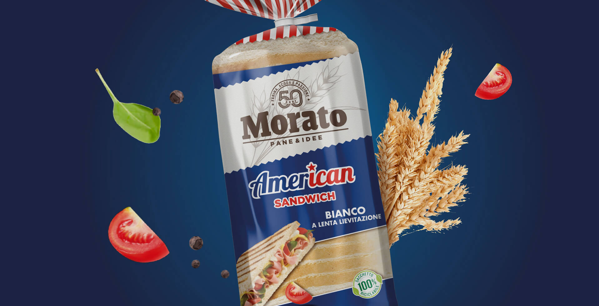
A new brand identity system
The agency’s goal was to ensure a proper relationship between brand consistency and line differentiation, so that each would continue to transfer its specific characteristics to the public, in a visual system that is nonetheless highly distinctive.
Among the American, Scrikki, Bread Chips, and Nuvolatte, a world of goodness is thus communicated that differs from competitors precisely because of the multifaceted nature of this approach and the distinct use of the colors and graphics developed.
A central and connotative element is certainly the transversal band that characterizes the packs: the latter ensures continuity between the products and at the same time allows a rather obvious visual differentiation between the various lines.
The creative work done for Morato is a combination of cheerfulness and functionality: on the lively pack we have in fact a part in transparency designed to be able to already visualize the product. This reassures consumers, going to increase customer loyalty.
Instead, an added value is given by the visual with its serving suggestion, as in the case of Bocconcini or Bruschelle. Already having an idea of how the product will be used and how it will be consumed invites people more to purchase, making the overall image even more attractive.
The communications team then followed the whole launch part related to the lines, taking care of the trade materials and the development of supporting “hero” videos. All the elements of this integrated communication went to enrich the visual and textual storytelling of Morato’s wide range, to renew its goodness and allow the brand to continue to expand in markets with a new colorful identity.


